Let’s get this out of the way… I believe in getting photos “right in-camera” as much as possible. However, you and I know perfect conditions don’t always coordinate with our schedules. So when I saw the flower in the “before” photo my choices were:
- Leave the camera in the bag, or
- Take the darn photo and see what I could do in Photoshop
There is no harm in trying. Right?
Instead of getting upset with myself for forgetting my diffuser or pleading with the clouds to return, I decided that at worst this would be a learning opportunity. Of course, if this experiment had failed it would just be between my computer and me anyway… Good thing it can’t talk!
 This is going to be the first in a series of “Before” and “After” editing guides. Hopefully you will get ideas by seeing my process. You certainly don’t need to follow what I’ve done exactly. In fact, what works for one image will sometimes look terrible on another. The plan is to share some methods and reasoning to give you ideas of tricks and methods to try in your own editing. This concept has been rolling around in my head for a while. Today I got a push to make it happen thanks to questions from the wonderfully supportive Artistic Floral Photography group on Facebook called Pholorography and lead by the talented and encouraging teacher and photographer, Jackie Kramer.
Make Lemonade Out of Lemons
So you can thank Jackie’s most recent group theme “Make Lemonade Out of Lemons” where we were all sharing our photo editing transformations and all the wonderful people who wanted to know more. You gave me the kick in the pants I needed to get this going.
Make It Better In Camera
Let’s talk about the issues with the original photo and better options. The light on this flower is from harsh, overhead, mid-day sun. This makes for strong contrast and sharp distracting shadows on the flower. It would have been a more appealing photo out-of-the-camera if I had taken it:
- When there was soft, overcast light from cloud cover
- If it were in the shade (sometimes I use my own body to create the shade for a small subject)
- If I made the light softer by using a diffuser (and possibly also a reflector too)
The background elements are also distracting because they are relatively sharp with uneven light. Using the techniques above would have also helped make the background less distracting too.
We Can’t Go Back In Time
So let’s try something. Actually, before I took this photo I knew I was going to try to use the Mixer Brush in Photoshop to even out the hard shadow edges and take advantage of the wide range of color tones from the high contrast light. I took care to make sure the parts of the flower with the brightest light on it was not over-exposed (or blown out) because I didn’t want to lose any detail in the highlights.
My camera settings were 1/200 sec, f/14, ISO 100
Once I brought this into Photoshop for editing I knew I wanted to:
- Add painterly brush strokes to the petals
- Create a softer, more pastel overall color palette
- Make the background more subtle and painterly
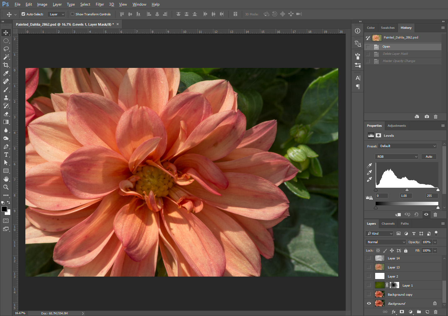
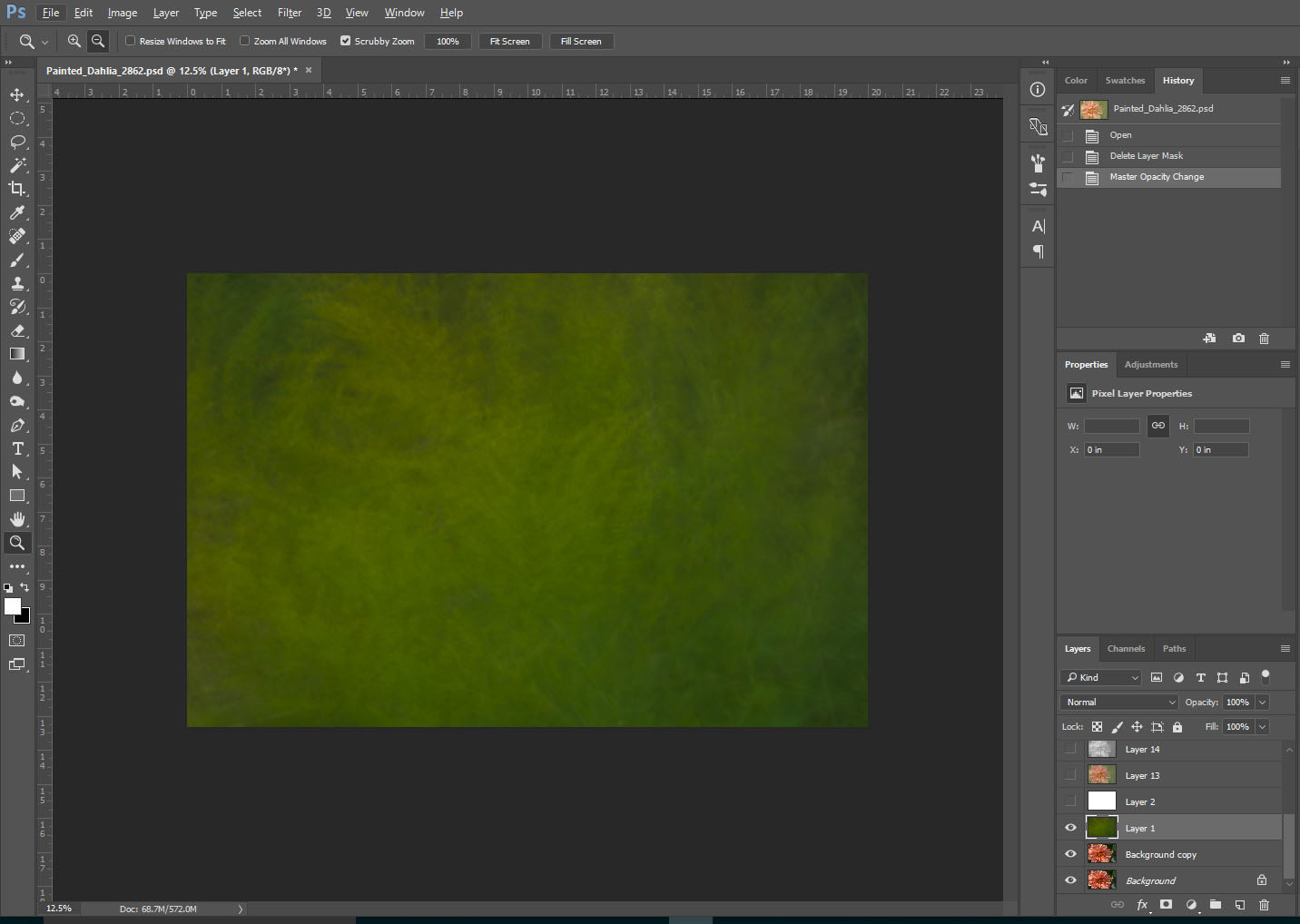
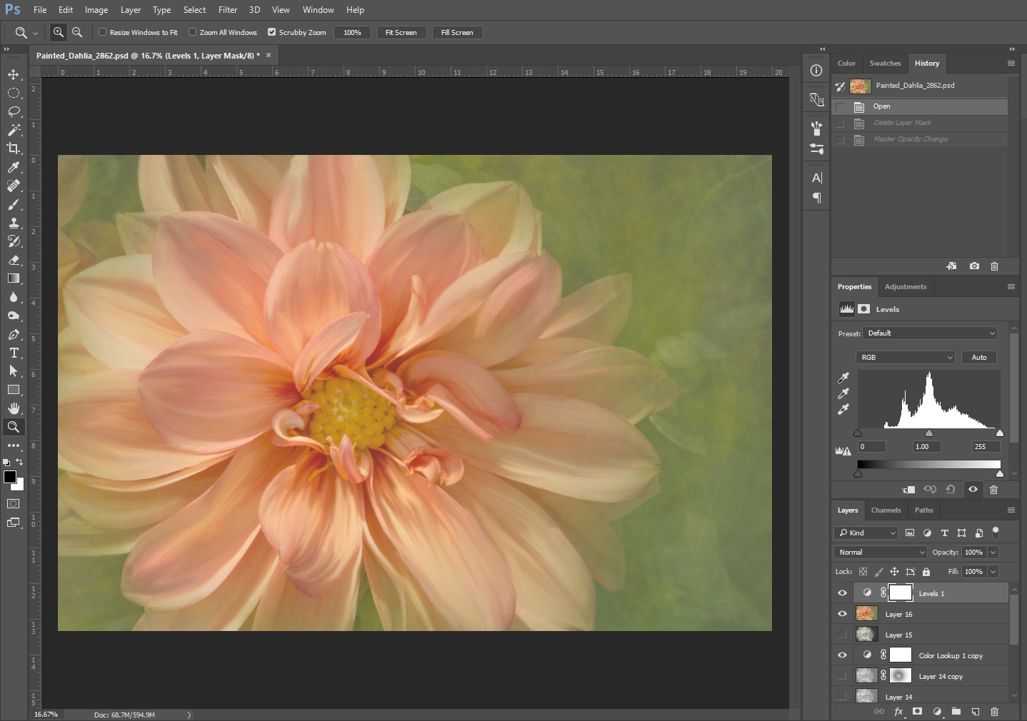
 To start I like to duplicate my background layer so I can turn off the layers above to evaluate the editing progress. On the duplicate layer I cloned out any blemishes then set to work adding brush strokes to the petals using the Mixer Brush (introduced in PS CS5) with the Spatter 24 Pixel brush tip from
 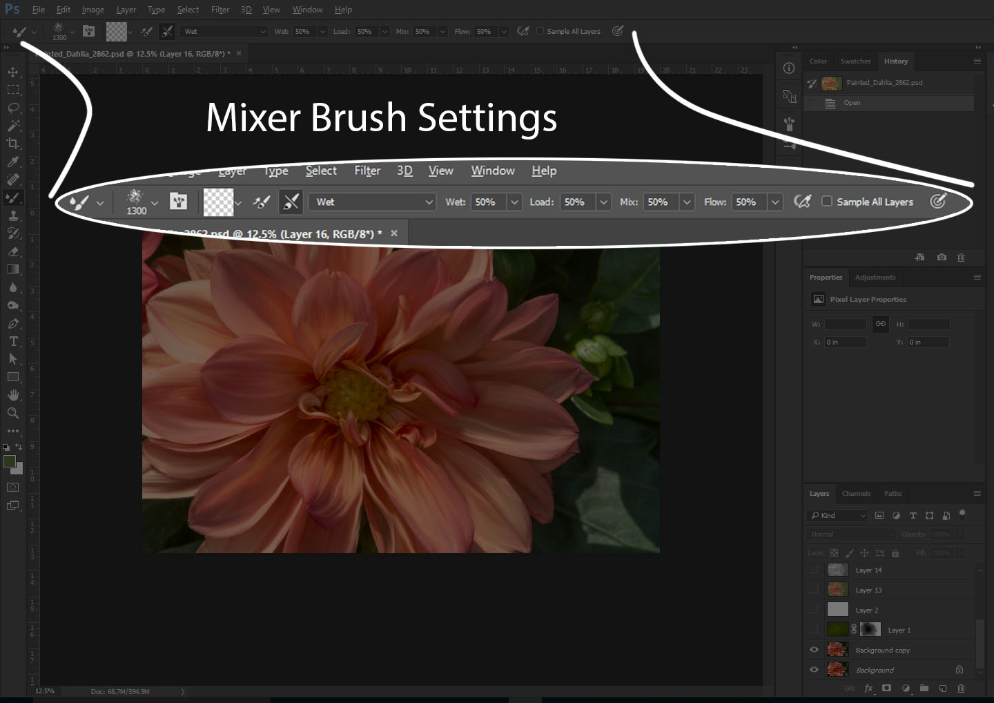 the default brush palette and a Clean, Wet brush settings. I took care not to brush on the edges of the petals so the edge lines would remain realistic and varying size and whether I was brushing from light to dark or dark to light.
Here is an easy-to-understand, detailed 10 minute video that will help you understand all the settings and functionality of the Mixer Brush tool by Scott Deardorff on YouTube.
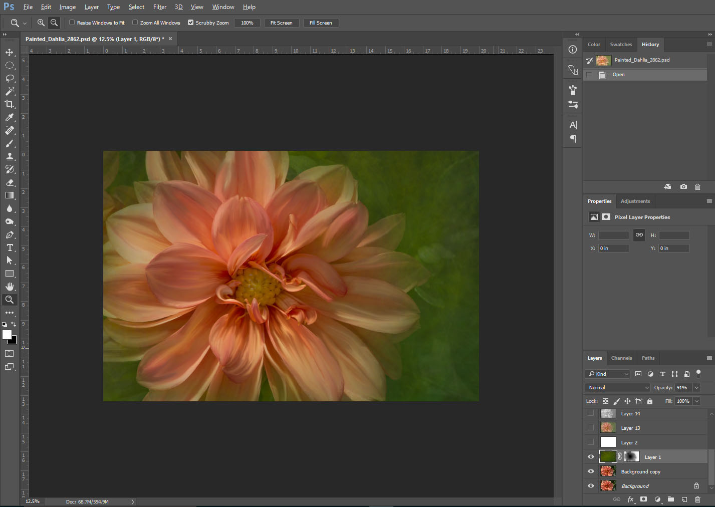 Then I added a layer with a texture I created from a multiple exposure photo of goldenrod flowers. I lowered the opacity of the texture layer to 91% with a normal blend mode and I masked it mostly off the flower with a soft brush.
Next I added a blank layer, filled it with white and lowered to the opacity to 22% 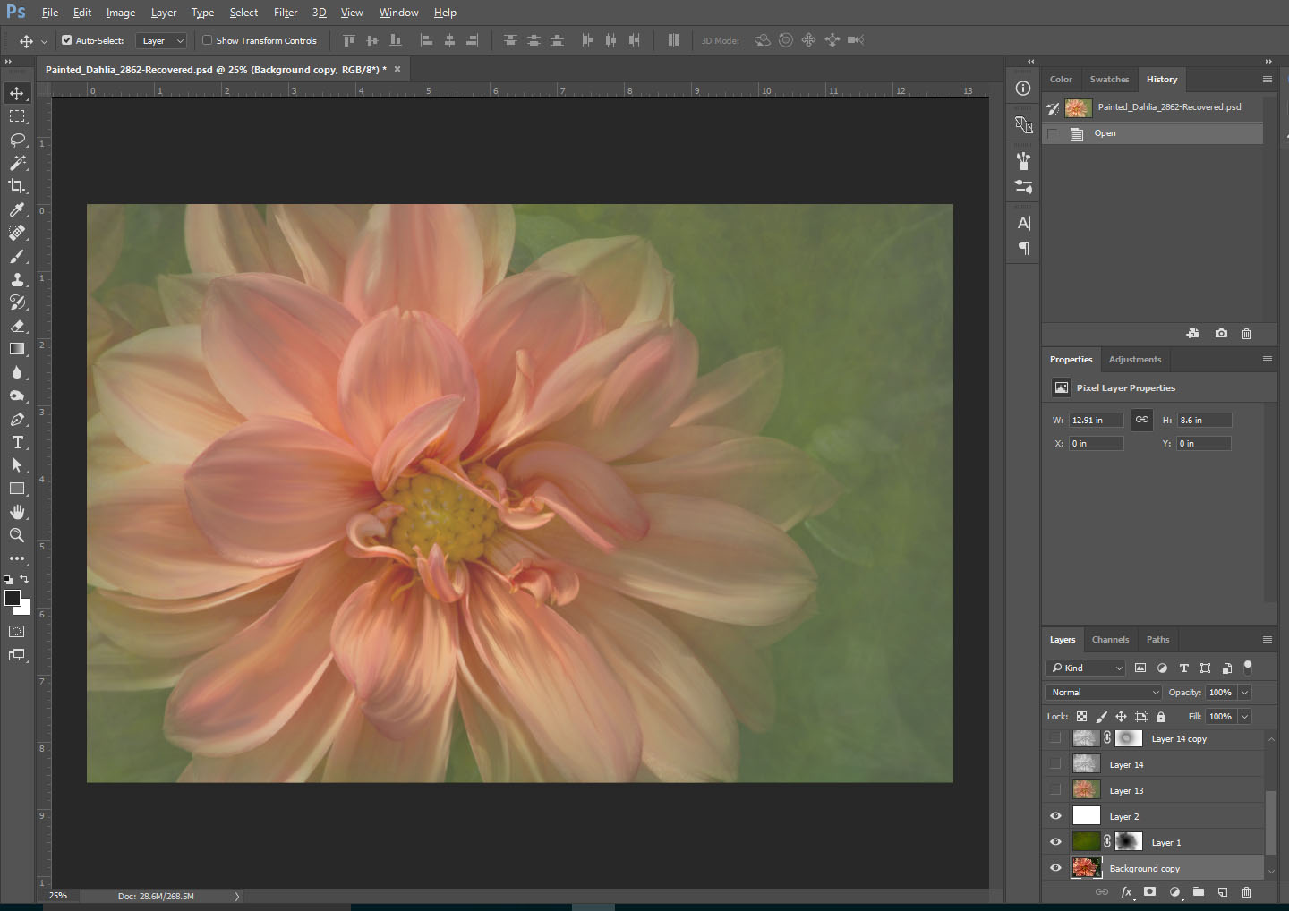 with a Normal blend mode. This made the colors more pastel and lowered the overall contrast, but it looked a little flat to me. I played with different ideas including converting it to black and white.
Finally I experimented with Color Lookup Table Adjustment Layers and found that using the “filmstock50.3dl” setting with the Normal Layer Blend Mode set to 46% gave my finished image the color, brightness, contrast and luminosity I liked.
Are We There Yet?
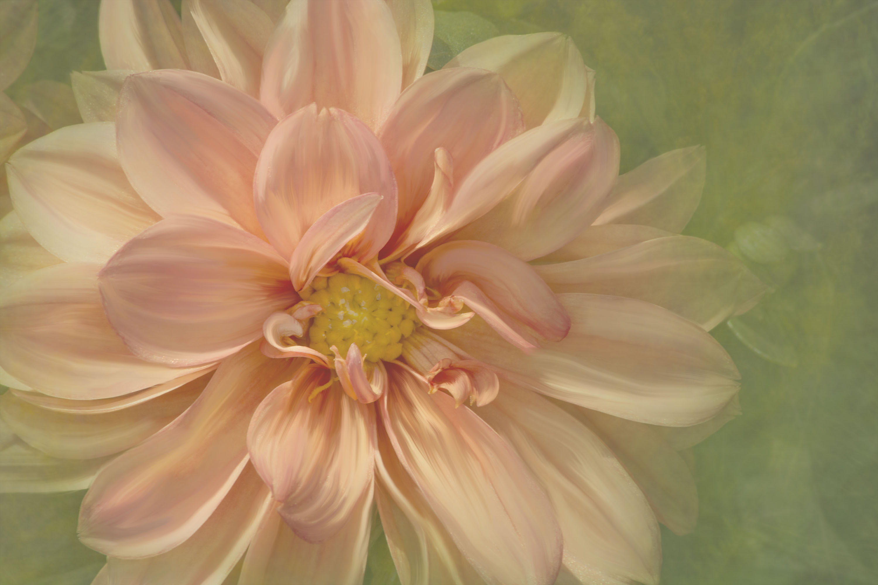
If you are like me the hardest part can often be figuring out when it is time to stop experimenting with your photos! This is my finished photo… For now.
Maybe I will crop some off the right?